Field mapping
Dozens of data fields reviewed and prioritized with the client.


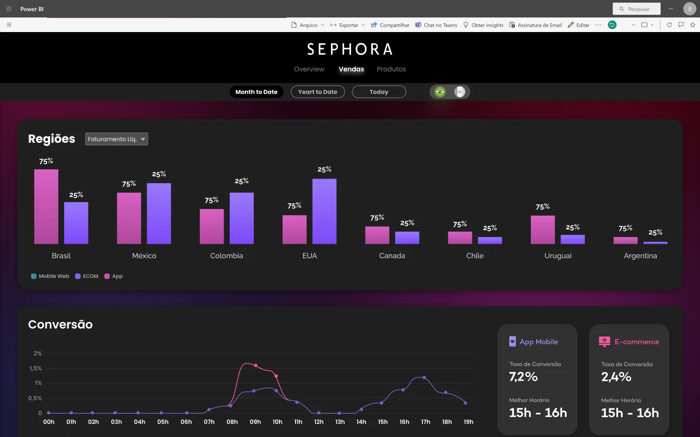
Sephora needed a clear view of digital performance across countries and channels. The dashboard brings sales, hourly conversion, product rankings and logistics KPIs into a branded, dark interface designed for quick executive reading.
Sales, product and delivery data came from many fields and sources. The team had to agree which metrics mattered before designing a view anyone could read in seconds.
Dozens of data fields reviewed and prioritized with the client.
App, mobile web and e-commerce compared side by side.
A premium look consistent with Sephora’s identity.
01
Validated which data fields were available for each KPI.
02
Overview, sales and product pages.
03
An interactive prototype with page navigation.
04
Stakeholder reviews with prototype data clearly flagged.
Regional bar charts by channel, hourly conversion curves, best-time-to-sell cards, brand rankings and logistics metrics — on a dark canvas that lets the data shine.
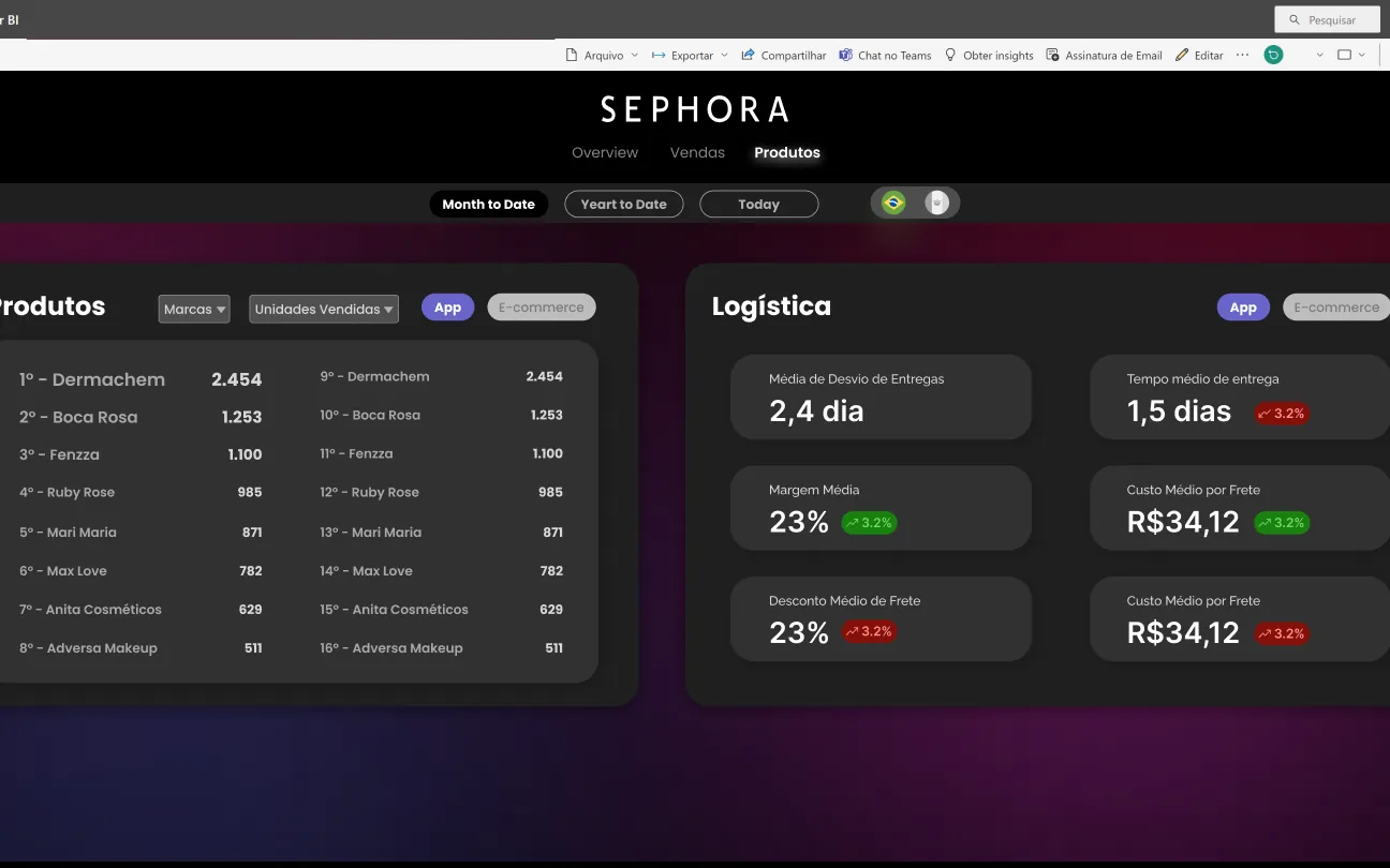
Key metrics readable in seconds.
App vs e-commerce performance side by side.
Field mapping aligned business and data teams.