Feedback-driven
Every screen reviewed for what to keep and what to improve.


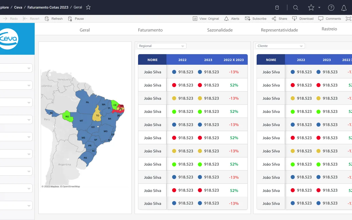
Ceva’s commercial teams needed to follow billing against quotas across business units, regions and sales teams. The project redesigned a suite of dashboards — billing, profitability traffic light, seasonality, activation and sales reviews — based on structured feedback sessions with users.
Users reported repeated panels, missing year-over-year comparisons and charts that couldn’t be read in a single view. The redesign had to decide what to keep and what to improve.
Every screen reviewed for what to keep and what to improve.
Business units, territories, customers and products.
Three-year comparisons side by side.
01
User comments collected on each existing dashboard.
02
Low-fidelity layouts for every page.
03
High-fidelity billing, seasonality and activation views.
04
Views by territory, customer and business unit.
A filter panel, tabbed navigation, a color-coded regional map and comparative tables showing year-over-year variation per seller and customer.
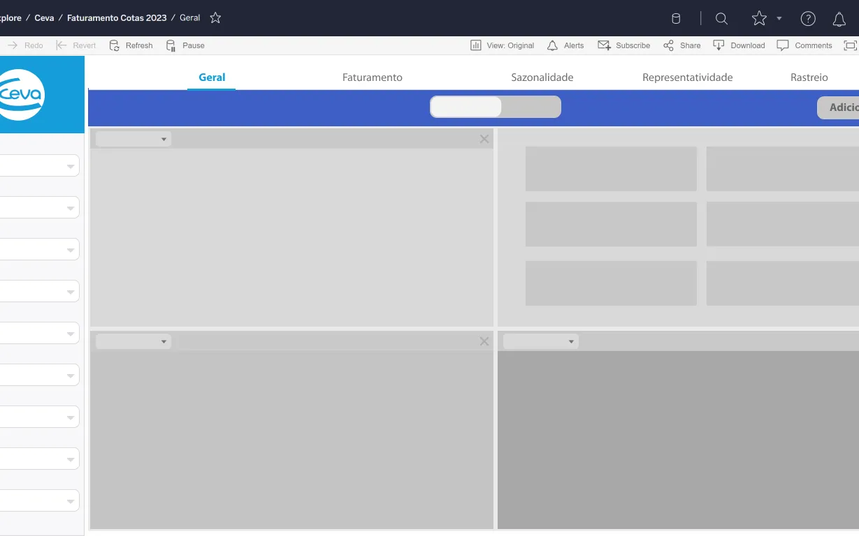
Each question answered without scrolling.
Side-by-side history for better decisions.
Designed from real feedback.