Discovery
Dozens of reports across products, sales and operations.


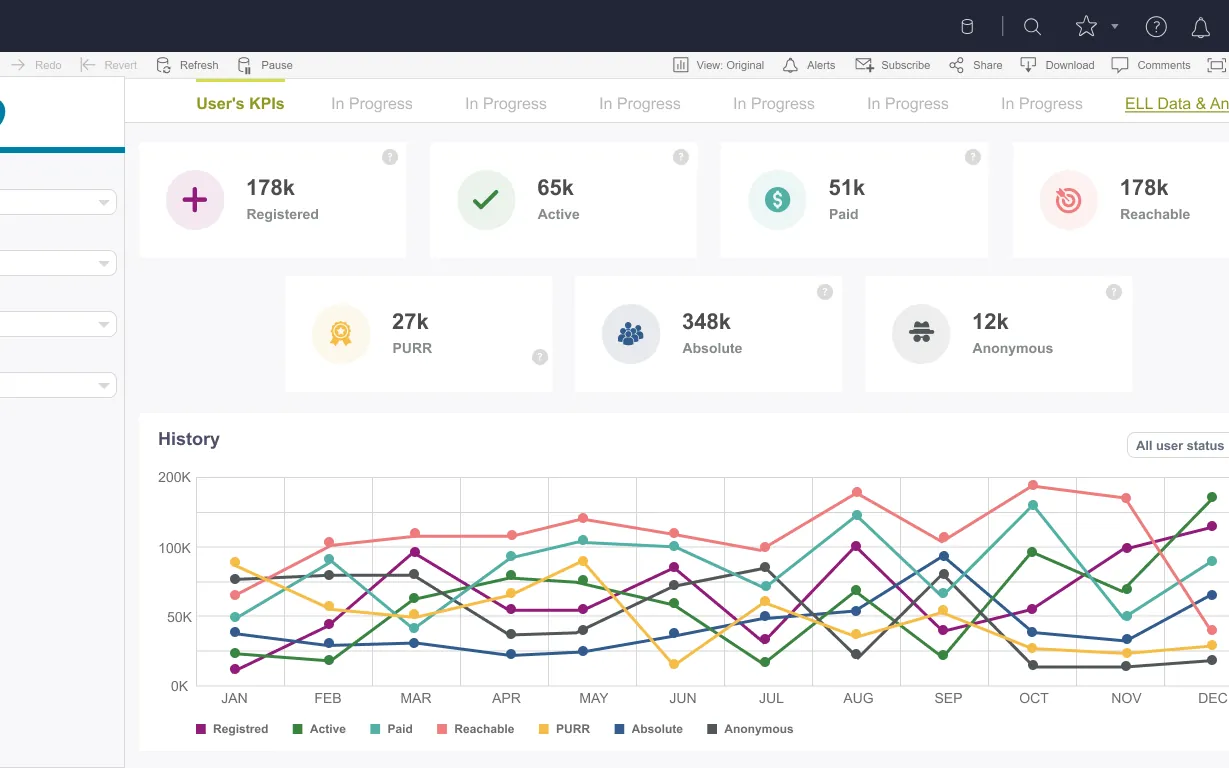
Pearson’s English Language Learning teams relied on many dashboards spread across sales, operations and platform data. The hub organizes them with search and filters by category, region and platform, and introduces a KPI view for user metrics.
People didn’t know which report answered their question. Dashboards had inconsistent layouts, and finding the right one depended on tribal knowledge.
Dozens of reports across products, sales and operations.
KPI presentation varied from dashboard to dashboard.
Filters for regions and platforms worldwide.
01
Dashboards catalogd with their owners.
02
Categories, regions and platforms defined as filters.
03
Home, search results and dashboard cards.
04
A user KPI dashboard with historical trends.
A faceted search with an owner on every card, and a KPI dashboard showing registered, active, paid and reachable users over time.
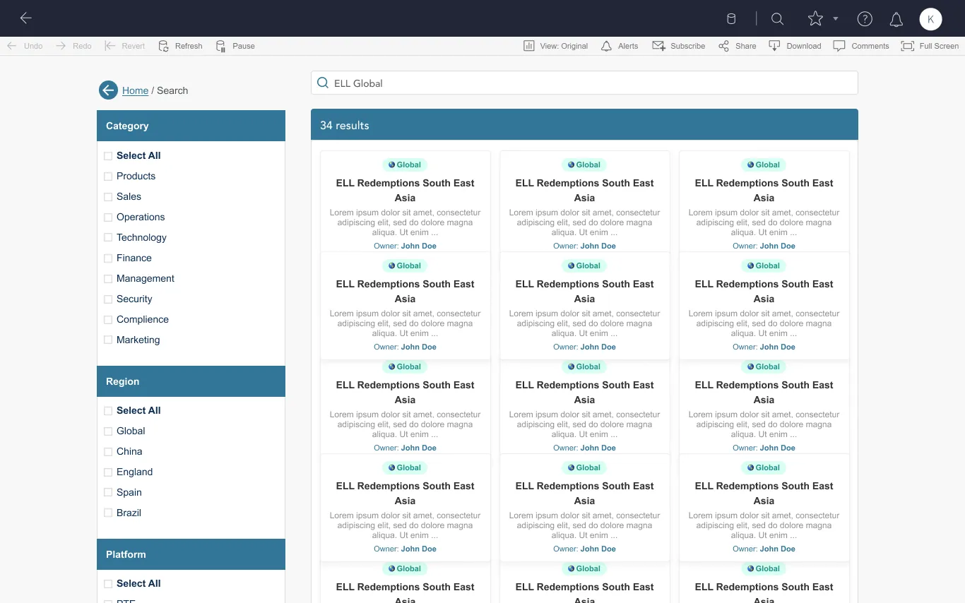
Every dashboard findable by keyword and filter.
Each report shows who to contact.
One visual standard for user metrics.